Difference between CSS display inline, inline-block, and block
The CSS property “display” can take values of “inline”, “inline-block”, and “block”. What is the difference between these three?
display: inline;
Here is a link (styled to look like a button as demo in previous tutorial) with CSS property “display: inline” …

display: inline
See how the element tries to take up as little layout space as possible. Even with padding added to the <a> element, the padding does not push other element away in the vertical direction. Although padding in the left and right does push the text away in the left/right direction.
display: inline-block;
Now if we set the CSS of the link button to be display as “inline-block”, its padding does push away other elements in any direction. The left, right, top, bottom padding all take up space in layout.

display: inline-block
display: block
When we use display: block, the element will take up as much space as possible with it width spanning the entire width of its parent element as in here …
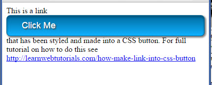
display block
Elements have default display properties
HTML element naturally have its own default display property even without you needing to assign it values for the display property. For example, the <a> and <span> elements naturally have display property of “inline”. The <img> and <button> element have display property of “inline-block” by default. And the <p> and <div> elements have display property of “block”.
You can see this when you put a span, a div, and a button within some text …
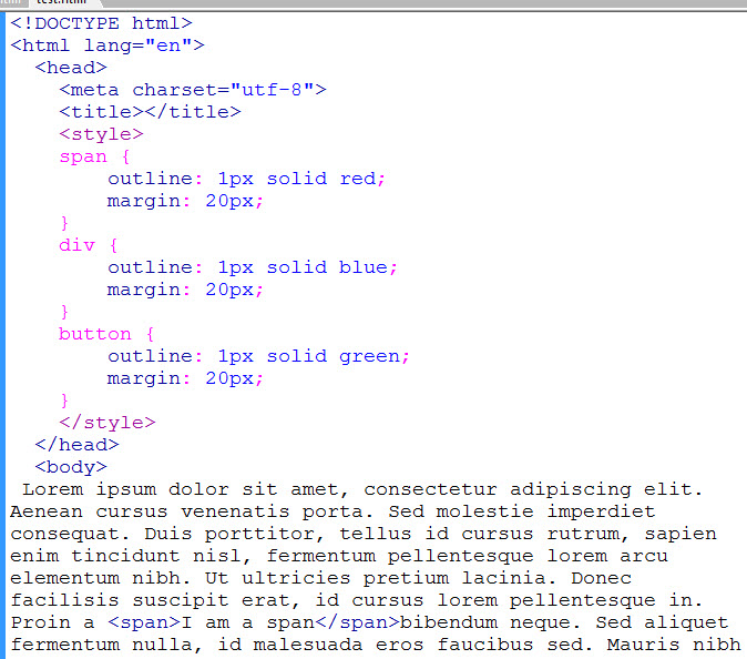
some elements in text
We added some outlines of red, blue, and green to each and gave them all margins of 20px top, bottom, left, and right. And this is what we get…
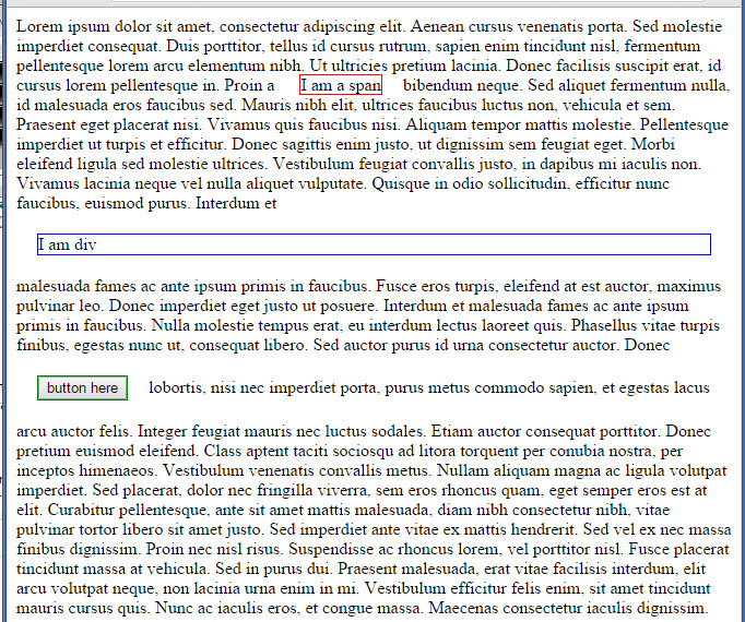
default display properties
For an inline element (the span outlined in red), the horizontal padding and margin does take up space. It pushes text away. But the top and bottom padding and margins does not take up space in the “line”.
An inline-block (the button) and the block element (the div) will take up space in all directions for padding and margin.
What is the display layout of an image?
We put an img in some text and see that it behaves like an inline-block.
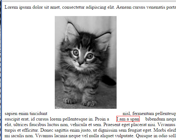
image is an inline-block
The text runs at the bottom of the image. Add vertical-align: middle to the image and you get …
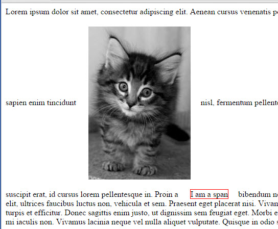
vertical-align middle


