How to Make a Link Into a CSS Button
Posted in Tutorials


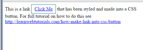
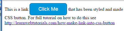
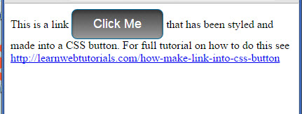
In this tutorial, we will show you how to make a link into a CSS button. Here we have a basic web page with a boring link that says “Click Me” …
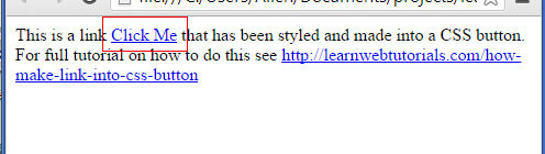
basic link
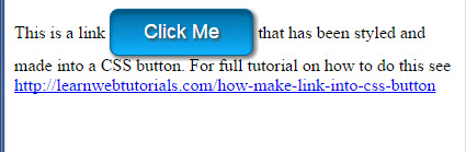
We style the link with CSS to make it look like this …
text-shadow on the text
The effects have been exaggerated a bit for the tutorial so that you can see better. But you might want to tweak and tone down the value a bit in your real application.
You can see full code in the live demo when you right click and “View Source” in your browser.
And in the course of the tutorial, we will learn about box-shadow, text-shadow, linear-gradient, border-radius, and more.
Basic CSS Button
The HTML we start with looks like this with a basic link …

link in HTML page
1. First we add a class style to our link element so that we can start to style it …
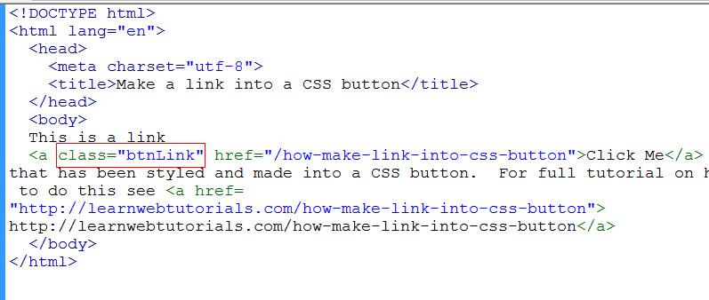
add class to element
We called our style “btnLink”, an arbitrary class name that we came up with. Come up with your own.
2. For the purpose of this tutorial, we will add a CSS style block with the CSS rule in the HEAD section of the HTML. In production code, you would add it to the referenced external CSS file instead.
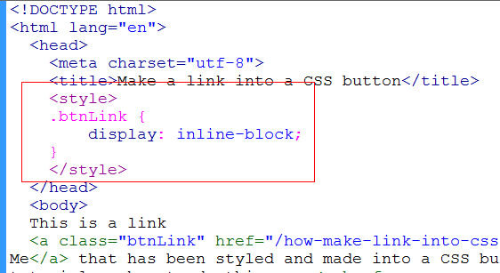
add css style block
In the style block, we didn’t put any attribute. If no attribute, then ‘text/css’ is assumed.
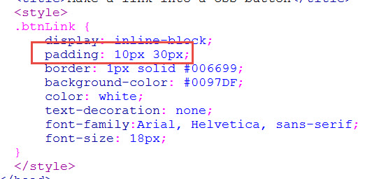
3. For our first CSS rule, we set …
display: inline-block;
An <a> link element by default has “inline” as display property. “inline” typically flows with the document and doesn’t have good “shape”. Display of “block”, on the other hand, takes up space. But it takes up too much space in that it takes the full width of its parent container. We use something in between such as “inline-block”.
4. By adding this property, it actually didn’t affect how the link renders on our page. It looks the same. Until we add some padding and border to our link like this …

add padding and border
We gave 5 pixels to the top and bottom padding. And gave a single pixel solid border of color #006699 (a darkish blue color).
And now our button looks like this it has some shape…
button with shape
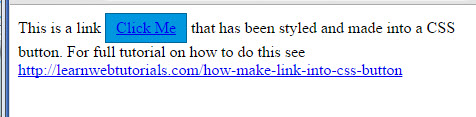
5. Let’s give it a background color to our button.
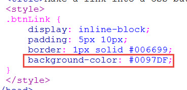
add background-color
We make the background color “#0097DF” to be slightly lighter than our border color of #006699. So it looks like this …
button with background color
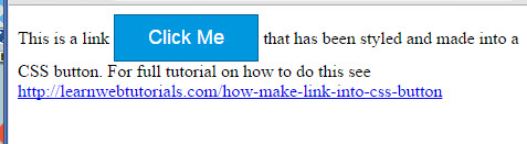
6. Doesn’t look too good because there is not enough contrast between the default text color and the background color. Let’s make the text color white …
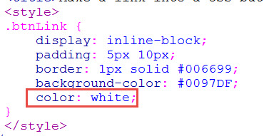
text color white
And so we get better contrast …
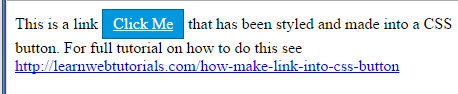
better contrast
7. But let’s get rid of the underline text. The text of a button usually don’t have underlines. We do this by setting text-decoration to none …
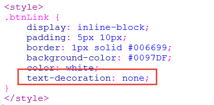
text-decoration none
8. And we now have a button …
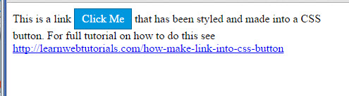
we have a button
Styling Options for Our Button
9. Maybe you don’t like the font of the button. No problem. Just add whatever font you like …

change font
10. And you can increase the size too. But then you need to make the padding more in proportion…
increase padding
And you get a bigger look …
font changed
Adding Hover Effect on CSS Button
11. When user hovers over the button, we want a slight color change like this …
button when hovered
We use the hover pseudo class to make that effect…
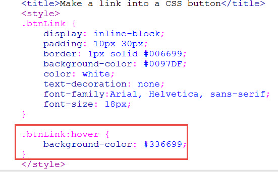
hover pseudo class
Adding Fancy Styles to Our CSS Button
12. The following is optional. You can add fancy styling to our button such as rounded corners. We put the border-radius CSS property next to the border property (although it doesn’t really matter).
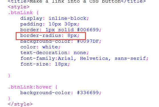
add border radius
And so we have rounded corners, even when hovered …
rounded corners
13. How about adding an inset shadow …
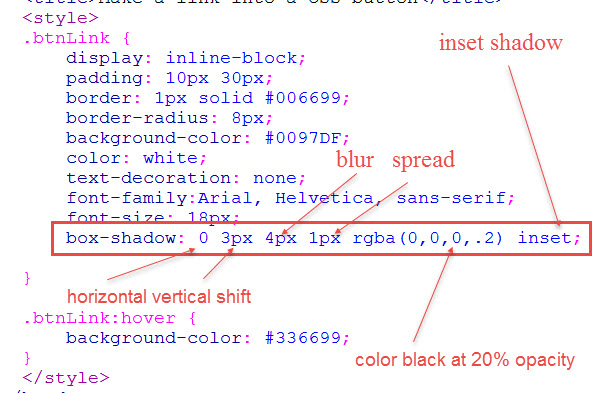
add inset shadow
See the difference…
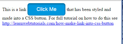
button with shadow
I’ve made the shadow a bit pronounced so that you can see it in the tutorial. But you might want to tone it down a bit and play with the box-shadow values. The values in order are horizontal shift, vertical shift, blur, spread, the color of the shadow, and the inset attribute. The spread is like the size of the shadow. The blur is how soft it is. Black color is RGB 0,0,0. So rgba(0,0,0,.2) is black at 20% opacity. Shadows are not solid colors. They look better at a low opacity value like 20%.
Note that box-shadow is not supported in Internet Explorer 8. You can still put in the CSS property. Shadow just won’t show up in IE8.
14. You can also add a linear gradient (which will not show up in Internet Explorer 9 or below)…
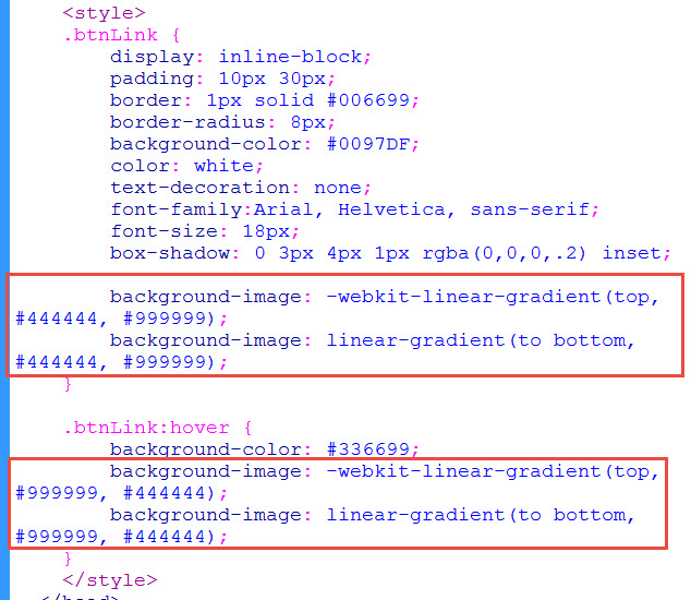
linear gradient
Color #444444 is a dark gray and #999999 is a light gray. We go from dark gray (the first color) to light gray (the second color parameter) from top to bottom. The older webkit browsers uses the “top” attribute to indicate this; while more modern browser uses the “to bottom” attribute. We put the -webkit- browser rule first. We put the standard “linear-gradient” property after that as override for browsers that understands it. If you forget, you can get this syntax from css3please.com
In the .btnLink:hover we simply switch the color order to switch the gradient direction as the button is hovered. The non-hovered button looks like this …
button with linear gradient
15. The gray gradient doesn’t do it for me. So I made the first color a slightly darker blue than the background color. And make the second color a slightly lighter blue than background color …
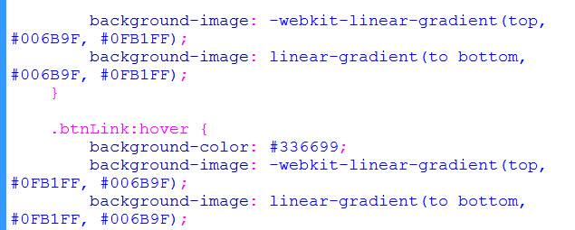
tweak the gradient colors
To get a better gradient like this …
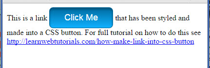
better color gradient
16. Adding an external box shadow …
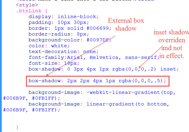
external box shadow
Note that this is not an inset box shadow (which is the inner shadow we placed earlier). This is a shadow outside the box. It looks like this …
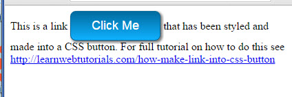
button with external box shadow
In fact, our second box-shadow property overrides our first inset box shadow. You mind as well take out that inset box shadow rule as it is having no effect. But since we got our linear gradient, we don’t need the inset box shadow anyways. But if you wanted both box-shadow rules to have effect, you can do this …
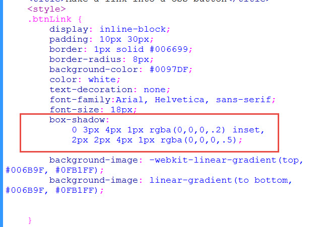
both shadows
See how we combined the two shadows into one rule. For modern browsers, they will render both shadows.
17. box-shadow is different from text-shadow. We add a text-shadow …
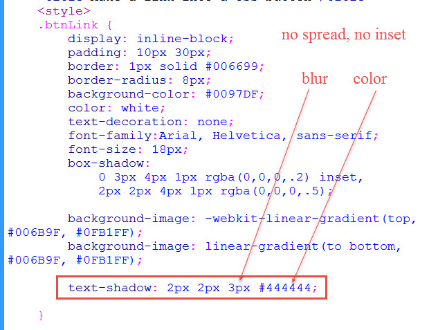
adding text-shadow
Like the box-shadow, the first two values of text-shadow are the horizontal and vertical shifts, respectively. The third parameter is the blur as usual. But text-shadow has no spread. And it doesn’t have inset either.
I’ve exaggerated the values a bit so that you can see what the text-shadow on the “Click Me” text looks like …
text-shadow on the text
Text-shadows are not rendered in Internet Explorer 8 and 9.
Difference between inline-block and inline
Many people ask what is the different between block and inline-block. To see, we take out the display: inline-block from our CSS (which the link then defaults to display:inline) and it renders like this …
without inline-block
If you put “display: block”, then it renders like this …
display block
So that is why “display:inline-block” is most suitable for button links.
Why not use a button element?
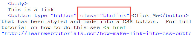
You can. But a button typically belong with a form and does not have an href attribute for you to link things to. A plain button element such as this …
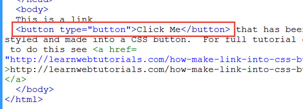
change to button
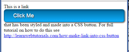
will render like this by the browser by default …
default button in chrome
By adding the class and styling it …
style to the button
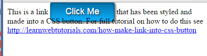
we make it looks the same as how we did for the link…
text-shadow on the text
The difference is that “button” is “inline-block” by default. So you can forgo the line “display:inline-block” that we needed fro the link.
Related Posts
Tags
Share This