Flexbox CSS tutorial align elements vertically
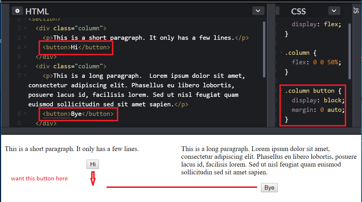
For this Flexbox CSS tutorial (see completed tutorial on codepen), we have two columns where we want the buttons to be aligned vertically on the same line like this …
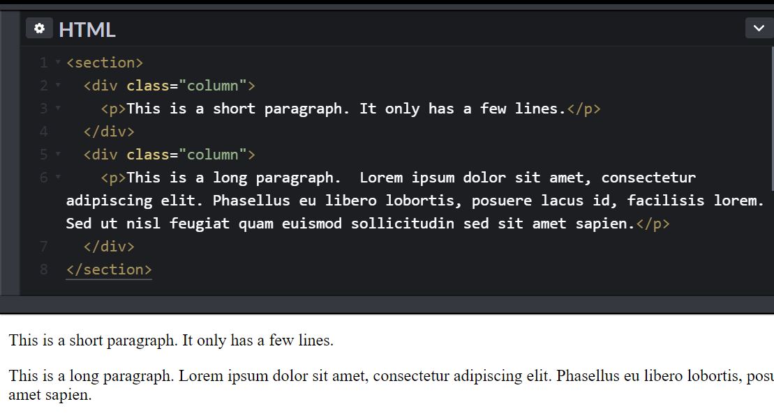
We start off with two paragraphs wrapped in a div …
We give the div’s class names of “column” because we want the two paragraphs into two equal columns like this…
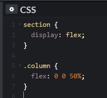
To accomplish this using flexbox, we add to the section container the CSS of display: flex. Note that while people call it “flexbox”, the display value is actually just “flex”…
The child elements which we want to be in columns we use the “flex” property shorthand …
flex: 0 0 50%;
The first value is how much to grow. The second value is how much to shrink. The third value is the default width which can be a percentage, a length such as rem or px, or auto, or 0.
Since we want the two columns to be equal width, we specify them to be 50%.
The above CSS rule is equivalent to …
flex-grow: 0;
flex-shrink: 0;
flex-basis: 50%;
However, the shorthand notation is preferred.
Now let’s add a button below the paragraph in each column and have it centered horizontally with the CSS shown…
The more difficult part is now we want the buttons to be aligned vertically so they are on the same line even though the first paragraph is much shorter. And it should remain in line even as browser resizes and height of paragraphs changes.
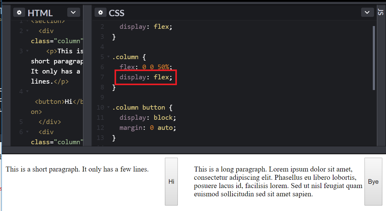
CSS has come a long way, before flexbox it would be difficult. But with flexbox, we can nest another flexbox inside a flexbox. We will have the column itself also be a flexbox. And its child will be the paragraph and button. Adding display: flex to the column, we get …
This is because by default the “flex-direction” is “row”. If we change it to “column”, we get back what we had …
Except that now “column” is a flex container. Which means that we can tell the children of the flex container to spread out evenly with “justify-content” of value “space-between” like this…
And there you have it. The buttons are vertically aligned.
The values of justify-content are …
flex-start
flex-end
center
space-between
space-around
space-evenly
You can try them out to see how they behave in codepen.
Note that we apply the “justify-content” to the flex container and not its flex children. Because the value affects all children of that container.


