Tutorial on Responsive Background Images using background-size
In this tutorial, we will show you how to make your background images responsive as in this demo linked here.
Here we have an example of a responsive web design with container div (with the blue border) set with max-width: 725px;
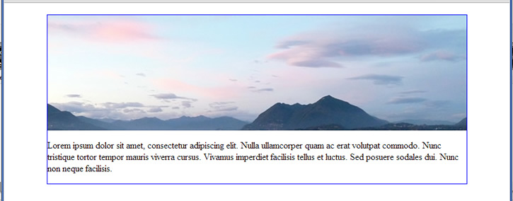
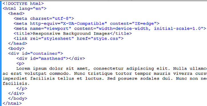
built with this HTML …
And with this CSS…
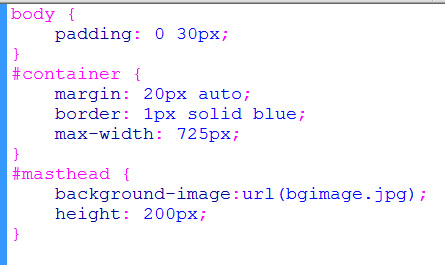
We see in the CSS that the masthead is holding the background image of bgimage.jpg (which is exactly 725px by 200px). That is why we set the height of the masthead to be 200px. When browser size is greater than 725px, the container stays at 725px and the background image looks good as shown above.
When viewed on small devices, the container sizes down as it should. But the background image does not.
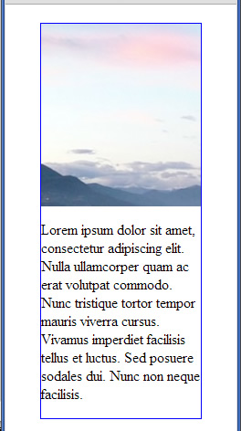
The background image is cropped on the right. If we center the background with background-position: center as in …
#masthead {
    background-image:url(bgimage.jpg);
    background-position: center;
    height: 200px;
}
then the background image will be centered and cropped on the left and right by equal amounts. It might make it look good enough to be acceptable (depending on your situation and background image). Nevertheless, the background image does not resize and height of masthead remains fixed at 200px (even at small screens which causes masthead to take up too much height screen space).
We are going to try to do better by making the masthead size down in height as the container sizes down. Let’s remove the fixed height rule.
#masthead {
    background-image:url(bgimage.jpg);
    background-position: center;
}
But because of our empty masthead, our height becomes zero and no image is shown…
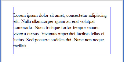
We need something to prop up the height of the masthead. Let’s use padding-bottom. We don’t want a fixed pixel amount, so use a percentage.
But what percentage should we set it at? Try 200 / 725 = 27.586% which is the aspect ratio of the height to width of the background image. We change our code to …
#masthead {
    background-image:url(bgimage.jpg);
    background-position: center;
    padding-bottom: 27.586%;
}
Taking a look in our browser, it looks fine as before when browser width is greater then 725px. But when small, it looks like …
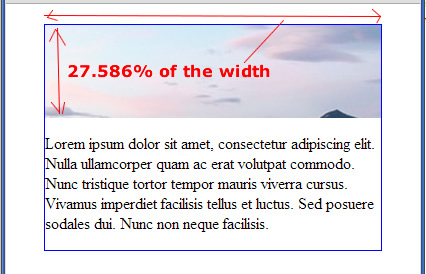
Well at least now the height of the masthead sizes down properly. In fact, the height is really the padding-bottom of 27.586%. By definition, it is 27.586% of the width of the masthead. So as the width of the masthead sizes down, the height of the masthead also sizes down. And it sizes down keeping the same aspect ratio, because the aspect ratio of 27.586% was the aspect ratio of our background image.
Although now the masthead sizes down properly, our background image never did change in size. (We don’t see all the mountain scene in the background image)
In CSS3, there is a property of background-size. Let’s use it with the value of “contain” as in …
#masthead {
    background-image:url(bgimage.jpg);
    background-position: center;
    padding-bottom: 27.586%;
    background-size: contain;
}
This forces the entire background image to be contained within the masthead. It looks like this…
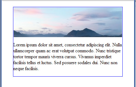
Due to possible rounding errors in our ratio calculation, things may not be exact. So you might want to improve appearance by adding background-repeat: none as in …
#masthead {
    background-image:url(bgimage.jpg);
    background-position: center;
    padding-bottom: 27.586%;
    background-size: contain;
    background-repeat: none;
}
Changing the background-size to “cover” would also work just as well.
#masthead {
    background-image:url(bgimage.jpg);
    background-position: center;
    padding-bottom: 27.586%;
    background-size: cover;
    background-repeat: none;
}
Although “contain” and “cover” does two different things, in our particular case because of our set aspect ratio, the two effect turns out to be the same. You can play with the demo page and do a “view source” here.
Unfortunately, IE 6-8 does not recognize background-size.
Learn more about the background-size cover and contain property in another tutorial.


