CSS Background Size Property
Posted in Tutorials


The CSS3 background-size property will allow you to control the size of your background images.
CSS background-size property is supported in …
- IE9+
- Firefox 4+,
- Safari 5+
- Chrome
- Opera
- For Safari 3-4 use -webkit-background-size
CSS background-size example
Suppose we have this background image that is 725px by 200px …

And we have a masthead div that is 400px by 50px created with this HTML and CSS…

Without the background-size property, the background-image attached to the masthead would look like this (as outlined in red) …
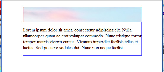
The background-image is at it own natural size of 725px by 200px attached at the top left of the masthead. Because the masthead is smaller than the background image, not all of the background image will be shown. This is the default behavior.
CSS background-size with fixed height and width
Now let’s add the background-size property to our CSS. The background-size property takes two values. The first being the width and the second being the height that you want the background image to be resized to. For example, if we add…
background-size: 400px 50px;
to our masthead div…
    #masthead {
        background-image:url(bgimage.jpg);
        height: 50px;
        width: 400px;
        border: 1px solid red;
        background-size: 400px 50px;
    }
we force the background-image to be 400px wide and 50px height (same size as our masthead). It would look like this …
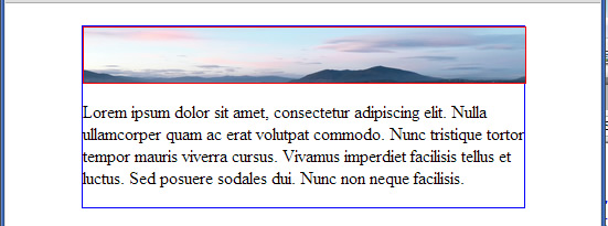
We see the whole image. The height is compressed because we have altered the aspect ratio of the image’s natural size. But sometimes that is okay (depending on your image).
CSS background-size with auto
Either of the two background-size parameter can be set to auto. If we set the second parameter to auto as in …
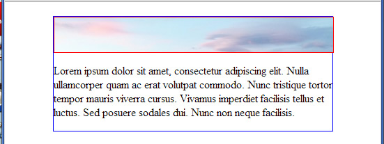
background-size: 400px auto;
The width will be forced to be 400px and the height will auto adjust to maintain the image’s natural aspect ratio. We get the following without any compression of the height. That is why you don’t see the full height of the background image.
If the second value is auto, we can omit it as in …
background-size: 400px;
This statement is equivalent to …
background-size: 400px auto;
CSS background-size with percentages
Writing …
background-size: 100% auto;
tells the browser to resize the background image to be the width of the element that it is attached to (which is our masthead width). It result would be the same as above with …
background-size: 400px auto;
since our masthead width is 400px.
Take another example of …
background-size: 100% 100%;
This would force it to show 100% of the width and 100% of the height of the background image in its container. We get as we did when we wrote …
background-size: 400px 50px;
The effect of …
background-size: 100% 100%;
is to stretch/shrink the background image in both height and width to exactly match its element.
background-size: contain
The background-size property can also take the “contain” value as in …
background-size: contain;
If we did that, we would force the browser to resize the background image without changing its aspect ratio so that the entire image is contained within its element. We get …
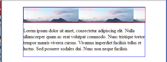
It had to size the height down enough to contain the whole image. But our masthead is much wider than the image. By default, it tiles the background to fill the width unless you tell it to …
background-image: no-repeat;
background-size: cover
Another value that is possible for the background-size property is “cover”. It ensures that one copy of the background image will cover the entire containing element. The browser will size up the background image if needed. But it will not size down. Because it doesn’t have to. A background image that is larger than its element will already cover it.
The values of background-size: contain and cover are useful in implementing the responsive background image technique demonstrated here.
Related Posts
Tags
Share This