Creating Bootstrap Tabs Panel
Posted in Tutorials


In this tutorial, we will create a tabs panel using Bootstrap CSS framework based on their usage documentation here. In the end it will look like this …
See demo here.
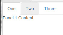
Bootstrap tab panel
1. We start with a basic HTML5 page and add CSS reference to the Bootstrap Library from Bootstrap CDN (if you go there, you will see the links to the Bootstrap CSS and Bootstrap JS).
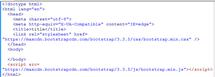
Bootstrap setup
For tabs, we are going to need both the Bootstrap CSS and the JS file. The JS is need to make the tabs interactive. Note that we use the minified versions. And it is okay (even recommended to use the “https” even though your site is only “http”.
2. If you are using Bootstrap JS file, then you will need to add jQuery library before it. Bootstrap JS depends on jQuery. This time we are pulling jQuery from Google CDN as shown…
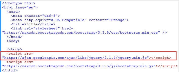
Add jQuery
3. The tabs will be unordered lists. We add the “ul” and “li” with links inside the “body” tag. We use links inside the li to make them clickable. The right shows a screen shot of what is rendered in the browser so far…
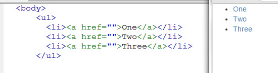
Unstyled unordered list
4. Add the bootstrap styling information by adding these classes to the “ul”…
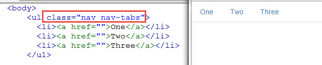
add Bootstrap classes
5. Make make indication that the first tab is active, we add the “active” class to the first “li”…
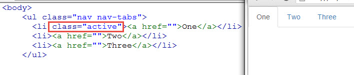
Make first tab active
6. Similarly, we add three panels as “div” with class “tab-pane” nested inside another div with class “tab-content” …
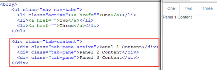
Add tab contents
7. We also made the first panel active with the “active” class attached to the corresponding div (as shown above).
8. When you hover over the tab, there is a color change. But when you click on the tabs, it doesn’t changes panels. We’ll fix that by first giving each of the panel an id …
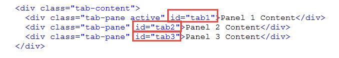
give panels and id
9. Then in the tabs, we reference those ids in the href of the links.
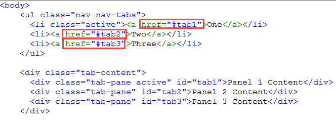
tab links
The hash # typically indicates that we are linking to someplace on the same page.
10. Still not working yet. We have to add the following because the bootstrap JS relies on them to make tabs work…
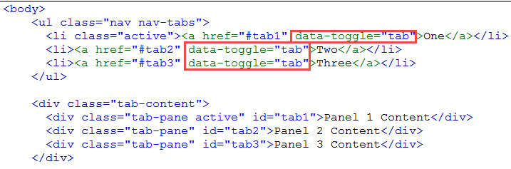
Add bootstrap interaction
The “data-” prefix in this custom attribute will let HTML5 validators know that we are using a custom attribute to the link tag that is not a part of the HTML5 spec. And the validator will then let it pass.
11. You now should have a working tab panel. See demo here.
Bootstrap tab panel
Related Posts
Tags
Share This