Tutorial to create a mobile drop down navigation menu
Posted in Tutorials


In this tutorial, we will create a drop down navigation menu suitable for mobile friendly or responsive web design sites.
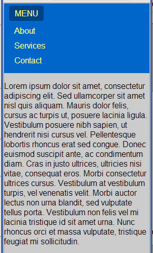
mobile style navigation menu
The menu items slides up and down as the MENU toggle button is clicked. DEMO here.
Getting Set Up
We start with basic HTML5 page with some dummy content …
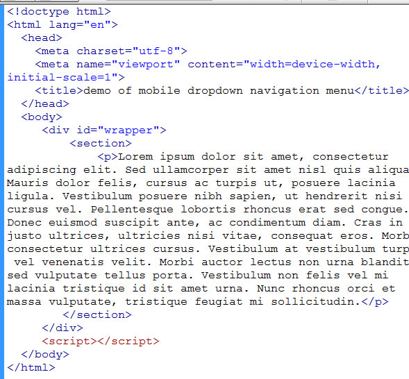
start page with dummy content
And we add some styling as follows. For the convenience of this tutorial, we are putting the script and the css on the same page. But as you know, for production code, you should refactor them out to their own files.
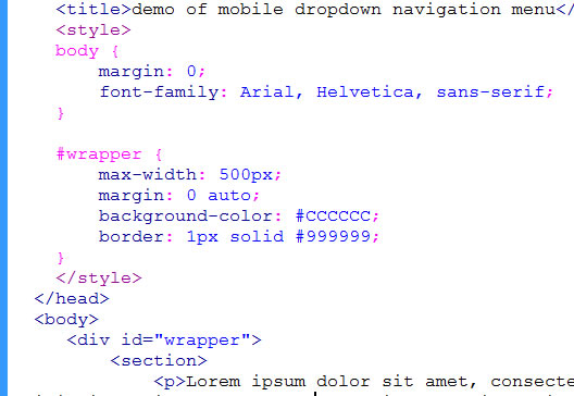
starter css
And so far we get …
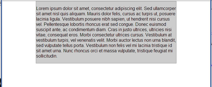
what we have so far
For this tutorial, we are trying to not put extra styling CSS that is not related to the drop down navigation so that you can focus on what is important for the menu mechanism. You can put in your CSS to make the page look more beautiful on your own later.
Adding the Navigation
Now let’s add in our mobile menu.
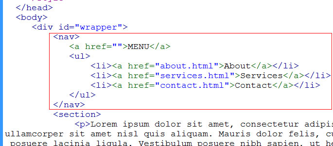
structure of mobile menu
The menu will be within the nav element. The first “a” element will be our toggle menu button with the text “MENU”. You can add in fancy stuff later like a graphic menu icon that is typical of mobile menus if you like.
Below the toggle button is the actual menu items. We have three of them: About, Services, and Contact. As is typical of menu items, they are in an unordered list.
Clicking on the MENU toggle button will display and hide the menu items.
Styling the Menu
Next we need to give it some styling. Let’s start with some basic styling to see where that gets us…
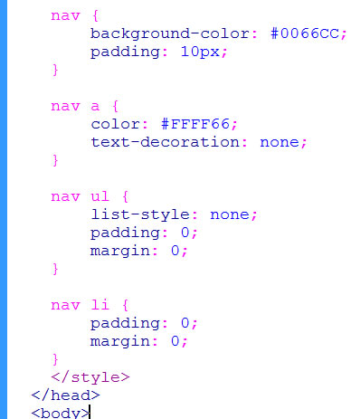
basic styling for menu
We zero out the padding and margin for the ul and li. We turn off the text-decoration for the links (normally menus items don’t have underlines). We remove the bullet from the unordered list by setting list-style to none. Give it some color and padding on the nav element and see what we have …
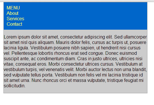
stying the menu
We need more spacing about the menu item and need to make the MENU toggle button look like a button. So …
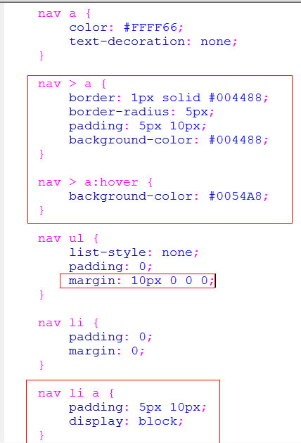
more styling
Giving the toggle MENU a border radius and a background color makes it look more like a button. Although hover effect won’t appear on a mobile phone (it can not detect the hover of your finger), we put in a hover effect of a lighter background color for those with a mouse on a desktop machine. Note that we use the direct child CSS selector …
nav > a
so that it select the “a” that is the toggle menu and not the “a” elements within the unordered list.
Since we have a horizontal padding of 10px on the toggle menu, we put the same 10px horizontal padding on the “nav li a” to have all the menu item text line up with the toggle menu text. Note that we put the padding on the inner “a” element rather than on the “li”. This is to make the “a” element (the clickable link element as large as possible). The “display: block” on these “a” elements makes the entire li area clickable. The “a” element takes the full length of the li.
So now we have …
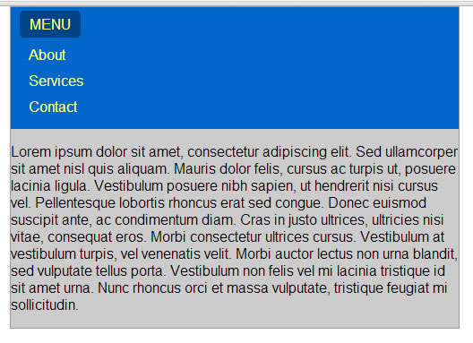
menu styled
Making the Menu Work
Right now when you click on the toggle menu, nothing happens. We want to make it toggle the menu items by sliding them down and up. The menu items should be hidden to begin with. So hide the “ul” with CSS like this …
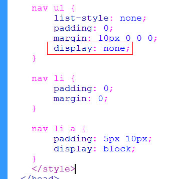
hiding the menu item with css
When MENU button is clicked, toggle the display of the “ul”. This we do with jQuery …
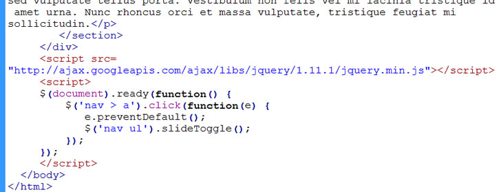
toggle menu with jquery
At the bottom of the page, we reference the jQuery library at Google’s CDN (content delivery network). Just Google “jquery google cdn” and you should be able to find it. We are using version 1.11 of jQuery.
After the jQuery reference, we can use jQuery starting with the standard document ready handler …
$(document).ready(function() {
// put jQuery code here
});
Inside the document ready handler is where we put our jQuery code. In particular we say that when “nav > a” (which is the toggle menu button) is clicked, then do the following …
e.preventDefault();
$(‘nav ul’).slideToggle();
The e.preventDefault() just tells the browser to not perform its default behavior that it would normally would have done if an “a” anchor link is clicked.
Instead jQuery will do the slideToggle instead. The slideToggle() is a jQuery function and we have applied it to the “nav ul” element, which is the unordered list containing our menu items. slideToggle() knows that if the menu items are in view, it will slide them up out of view when called. If they are out of view, then it will slide down into view.
Try it with the demo linked here.
You can adjust the speed of the animation, by passing various values into slideToggle as shown …
$(‘nav ul’).slideToggle(‘slow’); // animate slowly
$(‘nav ul’).slideToggle(‘fast’); // slide quickly
$(‘nav ul’).slideToggle(250); // fast: animate completes in a quarter of a second
$(‘nav ul’).slideToggle(5000); // slow: takes 5 seconds to slide up or down
Related Posts
Tags
Share This