Responsive two-column layout using flex box
Posted in Tutorials


In a previous tutorial, we created a two column responsive layout using floats. In this tutorial, we will build a responsive two column layout using flex box, which just means that we will be using the “display: flex” CSS property.
As in the previous tutorial, which goes into the details a little more, we start with basic HTML skeleton code …
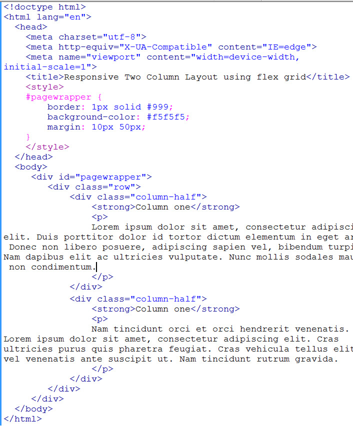
starter html
We use div of class “column-half” to represent our two columns (with dummy content). And div of class “row” to contain the two columns.
Viewing in browser, this gives us the two columns one on top of another…
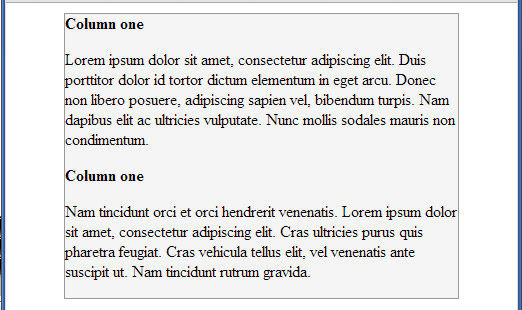
mobile view of two columns
This already gives us the mobile view by default.
Now to make the two columns side-by-side whenever browser viewport is greater than 500px. Put into a media query (of min-width: 500px) the following…
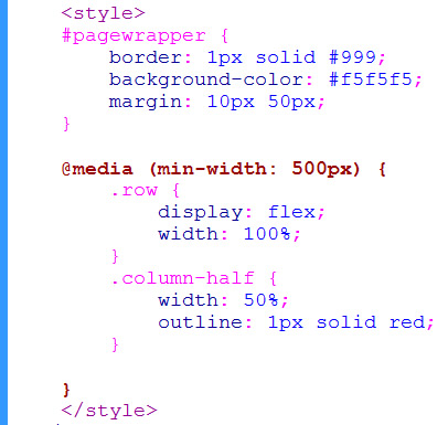
basic flex box css
That was it. This causes the two columns to be side by side …
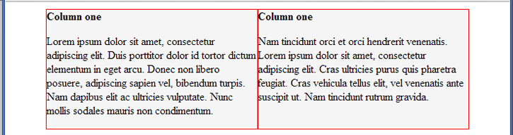
flex box with columns side-by-side
We simply specify “display: flex” on the row container. Set the container to be width 100%, and set the columns to be width 50%. The flex algorithm does the rest. We put “outline: 1px solid red” just to see where our columns are.
You can add padding to our columns if you like. It is not going to affect the layout.
There is quite a lot more to flex box, the article on css-tricks.com does a good summary.
Because we did not specify any of the advanced flex option properties. It assumes that the row container has “flex-direction: row”, which means column items to be laid out in row from left to right. It assumes “flex-wrap: nowrap”. It assumes “justify-content: flex-start”. And it assumes “align-items: stretch” which means that the two columns are stretched to be equal-height to height of container. (see red outline above).
Related Posts
Tags
Share This