How to build a responsive horizontal menu
Posted in Tutorials


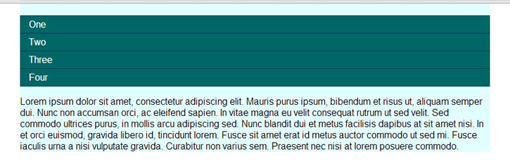
In this tutorial, we will build a horizontal menu that is responsive and become vertical in mobile view. Consider this horizontal menu shown in desktop view …
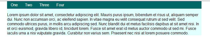
desktop view completed
If you narrow your browser to a small width of less than 500px or view from a mobile phone, the menu will collapse into a toggle menu.
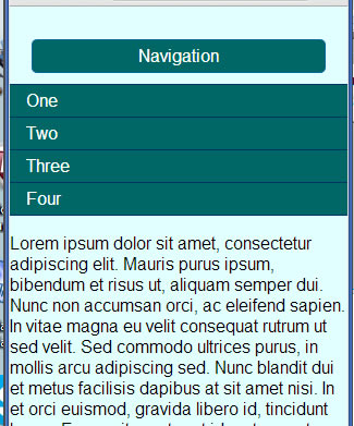
mobile view completed
The rational is that on a mobile phone, you won’t be able to fit the long horizontal menu.
The above doesn’t work, they are screen shot. But you can see working demo here.
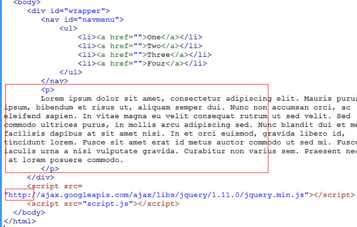
1. We start with a basic HTML5 page with support for responsive design. See link details.
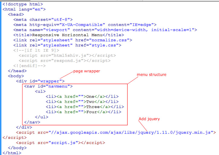
start horizontal menu
2. Then we add jQuery via the Google CDN (shown above). Because we will be using it later. Note that we added this above our script.js file. As shown the src is missing the “http:” in front of the //. That is fine in a live server out in the internet. But if you are testing on your local machine, you should add the “http:”
3. We have a page header of id=”wrapper”. And then we add our nav menu structure as shown above.
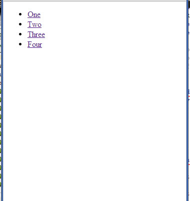
4. We are doing a mobile-first design. So we start styling in the mobile view by making our browser at a narrow width. So far the above code looks like this in our Chrome browser…
narrow view
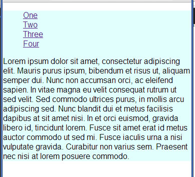
5. And add some lorem ipsum dummy place holder content.
add content
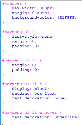
6. By default, the div of our page wrapper with the id=”wrapper” will be full width. But we will make our page width be a maximum of 800px wide in desktop view. We use max-width instead of width so that our wrapper can shrink with the width of our browser if it is less than 800px.
Add let’s give our page a light-blue color. And let’s get rid of those bullets in our ul. Write the following into our style.css…
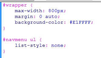
stylesheet
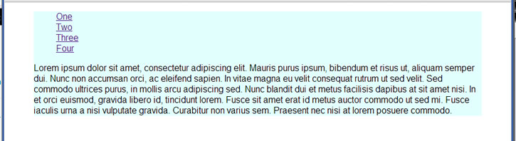
7. But why is there a gap at the top of our page?
mobile view
It is happening in the desktop view as well. But at least the “auto” in the margin value is centering our page horizontally…
desktop view
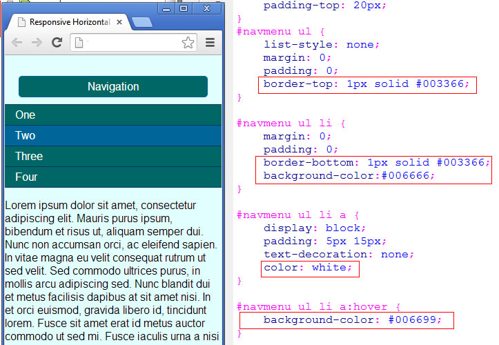
It is because the ul has top margin by default. This margin pokes out of the navmenu and out of the wrapper. Let’s zero them out with zero margin and zero padding on the “ul”. And we zero out the li’s as well.
style list
8. To space things out, it is better to put padding in the links of the “a” tag (see above). Because “a” tags are inline elements by default, we have to set display to “block” in order to make them behave like block elements so that paddings can be applied.
9. While we are at it, we get rid of the text-decoration underlines for the links. But show the underline upon hover. (see code above). Now we get the following. Note the top gap has disappeared.
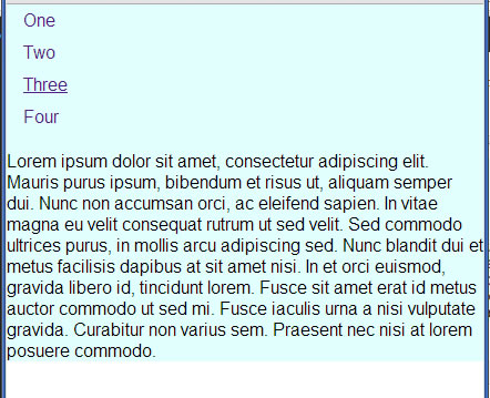
screenshot mobile view
10. We now add the navigation button that will be shown in the mobile view. We use the anchor element with id of navmenutoggle.
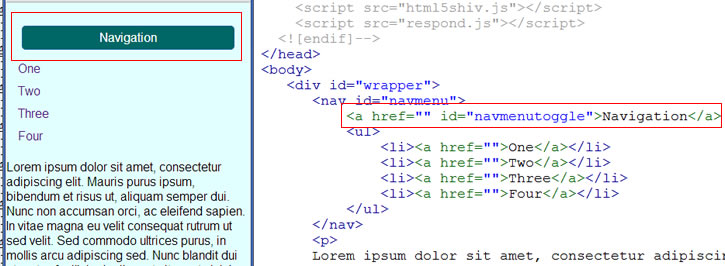
mobile navigation button
11. And we have to add some styles as shown below to make it look like a button…
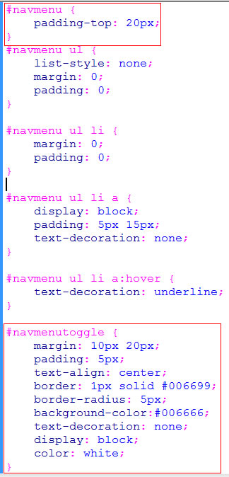
button style
12. The menu items needs more styling. Change the CSS to what is shown below. But I’m sure you can pick better colors.
style vertical menu
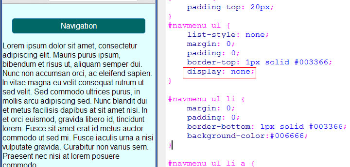
13. On mobile phones, we don’t want the vertical menu to take up the whole screen, so we hide the menu to begin with …
hide menu
We use display none on the ul so that it no longer is visible and does not take up any space.
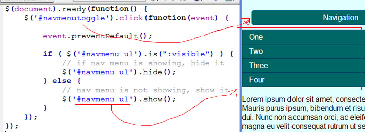
14. We display the menu when the navigation button is clicked. We make the navigation a toggle. So when menu is visible, clicking it would hide the menu. When menu is hidden, clicking it would display it. Since we had already added the jQuery library previously, we will start using jQuery by putting the following in our script.js file …
jQuery to toggle menu
Within the standard document ready event, we add a click handler for the element #navmenutoggle. That is the navigation button. First thing we do in this event handler is to prevent the normal default behavior of an anchor link click. This is done via the event.preventDefault() call.
Next we use jQuery’s “is” method to determine if our vertical menu (which is #navmenu ul) is visible or not. If yes, then we hide it with jQuery’s hide() method. Otherwise, we call show() on the #navmenu ul.
At this point, clicking on the navigation button would toggle the menu to show and hide. The mobile version of the menu is actually complete. And it should look like the above screen shot.
15. Now let’s work on the desktop view when our screen is wide enough to allow for our menu to be fully horizontal. At browser viewport width of 500px, it would be wide enough where we want our menu to be horizontally shown without the navigation button. At the bottom of our style.css, write media query…
start media query for desktop
Our desktop wide view should look like this …
desktop view
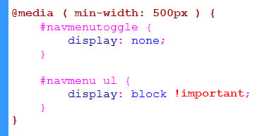
When browser viewport has a min-width of 500px or greater, we hide the navigation button (#navmenutoggle display none).
And we make sure we display the #navmenu ul list items with display: block.
Having “!important” in the display: block property for #navmenu ul is important (pun intended). If we did not put the !important here, the list items may not show up in the scenario where you resize the browser smaller than 500px and then click the navigation button a couple of times, and then resize back to desktop view.
The reason it won’t show in case like that is because when you clicked the navigation button a couple of times, you invoke our jQuery that hides the menu items. When resized back to desktop view, this hide still is in effect even though the CSS says to display block. In essence, the jQuery hide() takes precendence over the CSS display: block. To force the CSS to take precedence over the jQuery, we put the !important.
16. Now let’s flatten out the menu items and make them horizontal. The way to do is to float them left. Add the following CSS. In the code, we also got rid of the padding-top on the navmenu that was put in for the mobile view. Now we have…
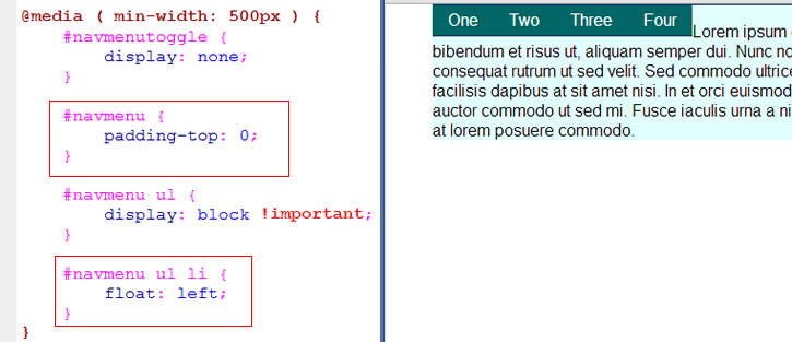
need clear fix
17. Ooops… Looks like we need a clearfix to get our horizontal menu to span all the way across. If you are not familiar with clearfix, take a look at the link to the reference in the previous sentence. So we add the clearfix class to our menu ul …
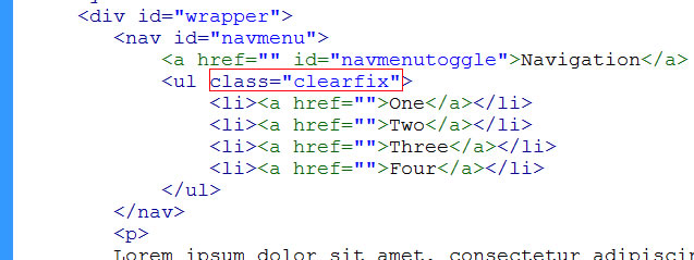
menu ul clearfix
And we add the following clearfix CSS outside our media query so that this class can be used for both the mobile and desktop views.
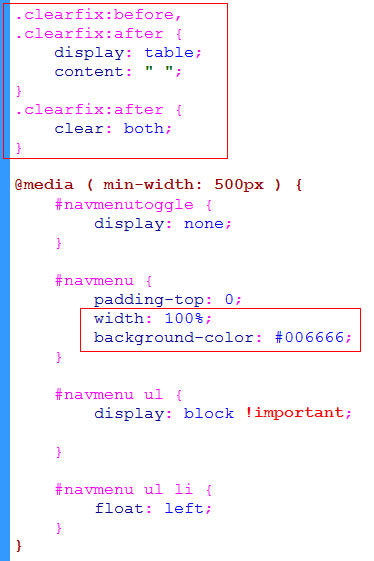
add clearfix to CSS
18. We also set width of #navmenu and corresponding background color to make horizontal menu span the full width like so…
desktop view completed
The horizontal menu is complete for the desktop view. Resize browser to show the mobile view to make sure that we didn’t break anything there in the process. And we did not. The full code is here.
Related Posts
Tags
Share This