Responsive Horizontal Menu with Off-Canvas
Posted in Tutorials


In the last tutorial we created an horizontal menu that became an menu icon in mobile view. In this tutorial, we continue to have the horizontal menu in wide browsers ….
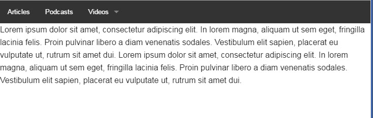
horizontal menu for desktop view
but it becomes an off-canvas menu in mobile view…
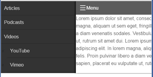
mobile view with off canvas menu
1. Continuing directly from the last tutorial, we have this code so far…
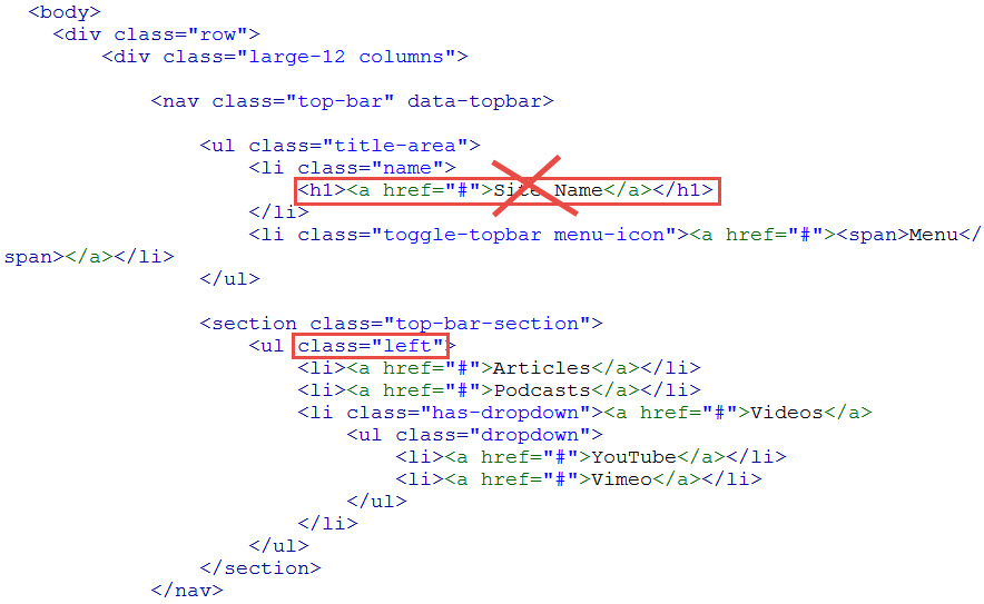
from last tutorial
Except we put the menu on the left side of the nav bar with the class=”left” and we removed the Site Name.
2. We also get rid of the two grid wrapping div’s…
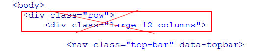
remove grid divs
3. And replace them with the two wrapping off-canvas div’s as described in our off-canvas menu code from another tutorial…
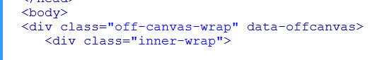
off-canvas wrapping divs
4. Copying the code from that off-canvas tutorial, we added it here …
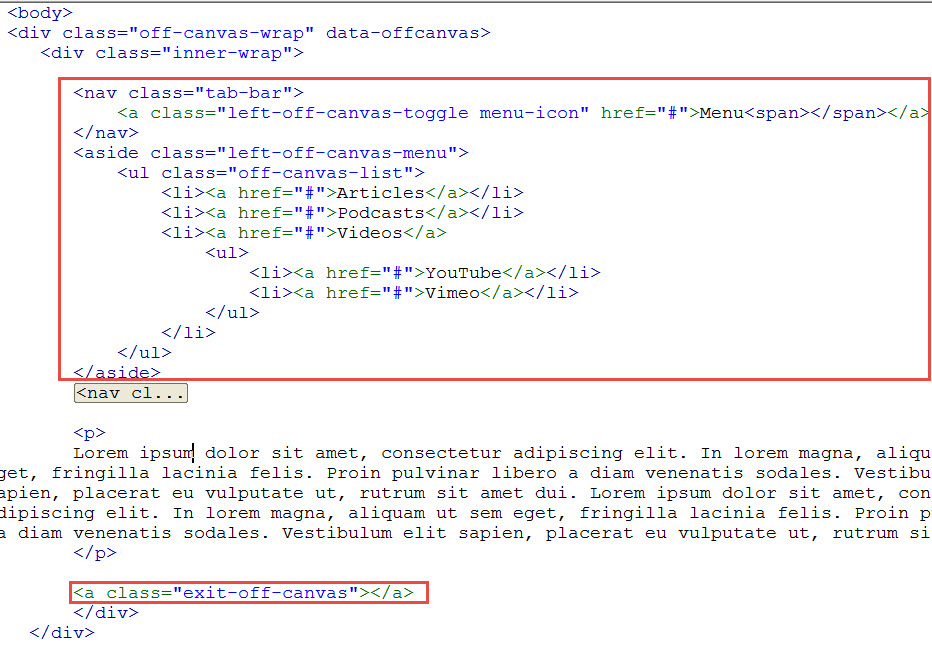
off-canvas code
Our exiting horizontal menu in the nav element is code-folded so that you can see the big picture.
5. For medium grids and up, we want to hide our off-canvas navigation. So we add this class …
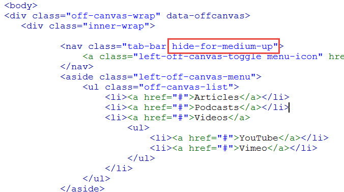
hide off-canvas menu
6. We want our top-bar horizontal menu to show for medium and up grids, so we add this class …
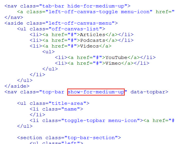
show top-bar
And that combines the two navigation systems of the Foundation framework.
Related Posts
Tags
Share This